(with a big bow to Marshall McLuhan)
When you were a mere toddler, it's likely you took boxes, pots and pans and turned them into toys. In grade school, we took plastic sheeting and turned it into sleds on the perfect snow of Hospital Hill. In high school we turned Chevys into love machines, and I furnished my first apartment with crates and boards transformed into tables and shelves.
We humans are geniuses at repurposing. We take a thing and apply it for the purpose that we require of it, even if that is not the purpose for which it was intended. And we come up with some pretty terrific solutions.
But sometimes, we repurpose something accidentally. We actually think we are using it correctly, when in fact, our failure to understand its essential purpose means that we are under-utilizing it.
This is what has happened with websites. Here are a few examples:
The company that spends $40,000 on a custom website design to have a look that is unlike anyone else's. Only to have to redesign the website from scratch two or three years later because the look is no longer current.
The small business owner who puts off his website design for months on end, because he has a "look" in his head and he's determined to achieve it. In the meantime, his online business suffers due to outdated technology and appearance.
The woman who loves minimalism - in her home, in her office, in her wardrobe - and insists that the website for her business mimic the same minimalism in its design - even though her business demands that a lot of information be shared.
What thinker/philosopher Marshall McLuhan taught us nearly 40 years ago was that we must employ each medium in a manner consistent with its inherent qualities and the way people use it. His point was that you couldn't separate the message from the medium (i.e., the medium is the message). Take billboards (please). A billboard is designed to be read while driving by at 55+ mph. You could certainly write a novel on one, but nobody would be able to read it. To use a billboard well, you have to think about what the user is doing when they encounter the medium (driving), whether or not the viewer can react instantly to the information (yes if it's to get off at the next exit, not as likely if it's to make an appointment), and what the user most appreciates in the billboard medium (tidbits of entertainment that can be fully digested in milliseconds). The physical reality of the billboard and the experience of the people viewing it are an essential part of the message itself. To use a billboard well, the message must be crafted in very specific ways.
The same thing is true of radio. Unless you have your own radio program, your options for reaching a radio audience consist of 15-, 30-, and 45-second spots. The medium requires that the message be fully understood without the use of visuals. The medium requires very tight writing. If the radio station is a music/entertainment station, the message has a better chance of being heard if it is itself entertaining. If the station is information-based, then an information-based message is likely to be effective. As with the billboard, the medium of radio plays a fundamental role in its message.
The concept of the website was developed by graphic designers excited about wireframes and by business visionaries excited about possibilities. And rightly so. But now it's time for us to be more thoughtful about the medium and how it interplays with the message.
Every type of website you can imagine - from a film studio to an accounting firm, from a music label to an online store - must provide content to its users. This is what people want from a website. They don't expect the website to give them a reflexology session, they don't expect it to repair their car, or test them for strep. Content. Information.
The information can come in the form of video, articles, infographics, pictures, social media streams. blogs, podcasts, and online flipbooks. Many of those content types are highly visual in nature. But here's where business owners often get off track - the website itself isn't a work of visual art. In fact, most websites - given what they need to accomplish - don't need to be very artful at all. They are containers for a broad range of content - content the consumers of your products and services want to access in order to cultivate the desire they need to make the decision to buy. And when the container gets in the way - either by being too much the center of attention or by taking too long to achieve - it undermines the real purpose of the website.
Think about it in terms of a retail store. A store is a physical reality, a room or a series of rooms in an architectural structure. The structure itself needs to accommodate the store - space for safes with floors strong enough to hold them, space for displays and consumer floor traffic, counters, cabinets, offices, and bathrooms. Some physical spaces are very elaborate and some are plain, but at the end of the day they are just physical spaces with conduits, plumbing, drywall, and flooring.
What ultimately makes the space is the information you put inside it. The information includes display cases, the products within display cases, the colors of the paint, light fixtures, lounge furniture, publications on display, signage, scents, sounds, and tactical experiences. The most magnificent architecture in the world won't compensate for poorly planned information inside the store.
The information in your website includes products, expanded information about products, company information, fonts, feeds from related content, embedded videos and graphics, interactive/social content, wish lists, ask-an-expert forums, and the shopping experience. The fanciest wire-frame design and most pricey website graphics in the world will not compensate for poorly planned - or missing - information.
Unlike real estate, the architecture of web design is changing rapidly. The conventions that looked good four years ago look stale today. The designs that look appealing today will be out-of-date again soon. And though most of us know it's too expensive to give our real estate a face lift every other year, the stakes for not maintaining a contemporary look on a website are high.
Is there a solution? Yes, there is. It's to stop spending all this money on custom websites! I imagine a lot of graphic designers are cursing me right now, but as far as small business owners are concerned, custom websites are a waste of money - and they are not necessary. You can create a website in Magento, Joomla, Drupal, or Wordpress with complete confidence that the underlying technology will continue to evolve. That means you don't have to invest in that evolution (though I strongly recommend providing some financial support to the open source community you commit to).
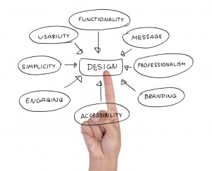
But what about the design? you ask. First, remember that design means a lot of things. The beauty of the design of each of these open source web platforms is the functionality, the ease with which you can integrate them with extra functionality, their tight integration with databases, and their constant evolution. And yes, design also means the look of the user interface.
If you take an open source program like Magento, Joomla, Drupal, or Wordpress, then pay a designer to create a custom front-end design for it, you are still throwing money out the window. Why? Because the next time you want to update your look, you will have to pay for additional custom design. The next time your core software takes a technological leap (which is happening every few years), you will have to pay for more custom design. The next time website styles change (which is happening every other year), you will have to pay for additional custom design.
Instead, use a design template made by a company who is making its money developing templates. Not just any template. Don't buy any one-hit wonders. Buy the template from a company like Infortis or Yoothemes, a company that is dedicated to updating its templates and keeping them relevant and functioning with the current technology. A company that is staying on top of - or even setting the trend for - what is hot in website design. Then pay a website expert to tweak and tune that template to match the colors, fonts, and essential feeling of your brand.
Now it's the designer end of my customer base that's in a dead faint. "But I make beautiful jewelry! My website has to convey my design ethos!" one says. "I am known in the fashion world as a fashion adviser. My site has to convey my fashion sense!" But is that true?
When you advertise in a magazine, does your ad pop up in 3D to show your design ethos? Or do you simply choose colors and a layout that express your brand in a consistent manner? Because print ads are terrible at being anything but one-dimensional, though they are terrific at showing a photograph of amazing design.
When you run a radio spot, does your spot appear to be adorned in fashionable clothing? Or do you simply choose words and music that express your brand in a consistent manner? Because radio is absolutely awful at showing anything visual, but it can do a terrific job of conveying a message.
When we expect any medium to achieve things for which it wasn't designed -or that the cost of achieving isn't worth - the medium, and therefore the message, is undermined.
If you look at some of the most powerful, profitable websites, you will see that the design isn't particularly noteworthy. Amazon isn't that great to look at, but it is the king of all content providers. Lands End's design elements begin and end with simple navy blue elements, but they sure do sell a lot of clothing and home goods. The website for the Art Institute of Chicago has exceedingly basic design elements, but the website performs beautifully and looks beautiful because they use images to convey the mood. There is nothing designerly or artiste about Jeff Koons' website, but it does a terrific job of sharing information about his body of work.
The underlying promise -and therefore, the message - of websites is content, experience, information, engagement. To sacrifice any of those things for an idea of the prettiest, funkiest, coolest, or most luxurious graphic design is to undermine the medium. To pay $50,000 for a look when you could have spent far far less and put the rest of the budget into content development is to undermine both the medium and your business. And to spend precious marketing dollars on elements that don't ultimately bring value to your business or meaning to your message is unwise.
Learn to use each medium for the purpose it serves best. Use the print medium to engage the visual senses and convey color and richness in a way that cheap monitors cannot. Use video, film, and television to tell big stories. Use billboards and social media to deliver snackable content. Use radio to speak directly to your customers and engage the sense of hearing. And use your websites as a container for all those exciting elements - and more. More information, more detail, more engagement, more content. Stop trying to make the body into a dress. After all, in the case of the website, it's what's inside that counts.
